top of page
moodboard_mindmarker.png
Fierce-Logo-Rectangle.jpg

Fierce, Inc. is a leadership development and training company that drives results for business and education by developing conversation as a skill. 

With ten years under their belt, a handful of leadership seat changes, and various implementations of brand strategies.
It was time for a brand audit to re-align the visual brand
language across all touchpoints.

Role: Principle Design | UI | UX | Art Direction | In-house Design

Deliverables: Refreshed Branding Assets Company Wide

audit timeline.png

The first step was to identify the problem. I took over our main conference room with printouts on the wall of instances where the brand visuals were used. Marketing assets, event flyers, blog posts, keynote presentations, business cards, and everything in between. It didn't take long to recognize the patterns of inconsistency. There were different uses of the core brand colors, various iconography/typography, outdated brand messaging, and five different types of business cards. It was clear there was a problem.

Employees, facilitators, contractors, speakers, and authors collected materials over ten years. The company had seen such a fast growth rate that it couldn't maintain a cohesive branded experience across its customer touch-points.

stage 1_ different_1.jpeg
Stage 1_2.jpg
Pages from stage 5 what can be discontin
Stage 1_4.jpeg
Stage-1_6.png
Stage-1_5_edited.png
Stage 1_3.png
Stage 1_5.png
fierce_whiteboard_2.jpg
fierce_whiteboard.jpg

A strategic deep dive into the brand story was next, and we reviewed the fierce brand definition, values, messaging, and promise. Working with marketing and executive teams, we identified user pain points with the brand and looked for areas for strengthening the connection with the target market.

sketch book_2.jpg
stage2 visuals.png
stage 4 visuals.png

Working with the head of each department, we looked at what assets were in the current rotation, how they were being used, and where they were located. During this stage, we started to compile a 2 part list. What would be phased out, and what would be marked for a refresh?

Prioritization of development. What gets updated first, last, and why? Who will do what, what is the timeline, and are there any future commitments or milestones to consider that could affect the timetable? What will be phased out, what will we use in the future, and how?

stage 6 visuals.png
fierce competitive analysis.jpg

To help inform the development of personas and hypostasis statements. The research was conducted in various forms: competitive analysis, surveys, questionnaires, interviews, and conversations with one-site customers.

​Ideation followed with mood boards, sketching, and testing out potential solutions. The concepts were then presented to our internal teams for feedback. And externally with surveys, A/B testing, and analytics.

Ideation-sketching.png
persona portfolio.jpg
mindmarker moodboards.jpg
moodboard mockup.png
external blog facebook.jpg
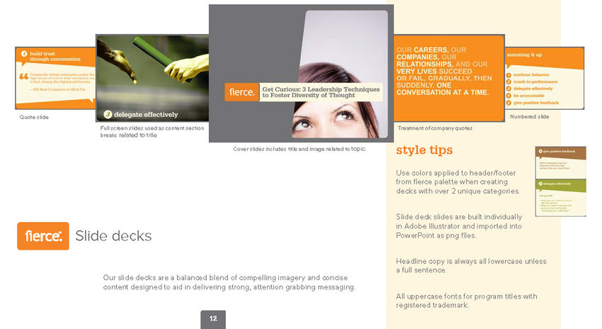
strategy_presentations.jpg
Pages from Home page sketches.png
sketch_2.jpeg
sketch_1.jpeg
sketch_3.jpeg

The final rollout was applied to all branding assets across all customer touch-points (with the exception of the website which was handled by an external agency). 


In addition to the visual components, a new cloud-based storage system with new information architecture and naming conventions was rolled out company-wide.

cloud storage.png
ATD_edited.jpg
bottom of page